289. Nanjing Li Zhi

The cover shows Li Zhi’s 2004 to 2018 best-of CD, which I unwrapped over the weekend. It’s really good and I love it, and played on my cassette and CD player it has a wonderful feel.
Down-to-earth tech I come across each week, picked out and shared here. Follow the newsletter to get updates.
Trending Tools
My 10 Best Practices for Life
https://tw93.fun/en/2026-11-03/senior.html
Someone online sent me a private message. They’re a computer science major, feel that AI can now completely replace their assignments and papers, and asked whether this industry still has a future and what advice I’d give. So I thought about what I would do if I were in my senior year right now, to avoid some pitfalls and have a smoother road ahead. Of course my experience is limited, so I’d love to hear your thoughts.
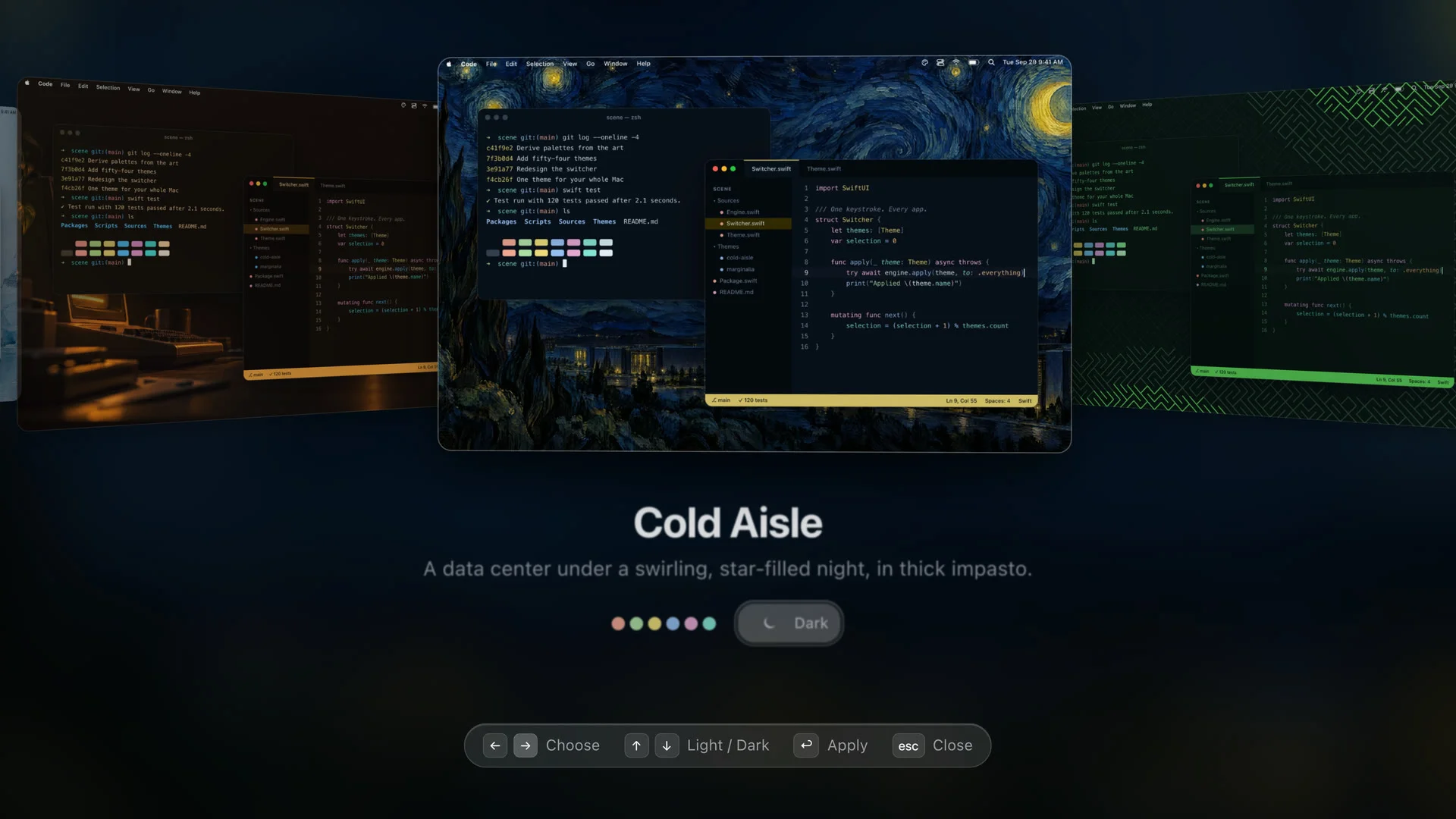
Scene: keep your Mac and your apps on one theme
https://github.com/InsaneArts/Scene
The effect is quite fun. Inspired by the Omarchy desktop, the author lets your Mac’s wallpaper, editor, terminal and so on all share one theme. Really interesting, though I’m fairly restrained myself and just like simple things these days. If you like something flashier, have a play.
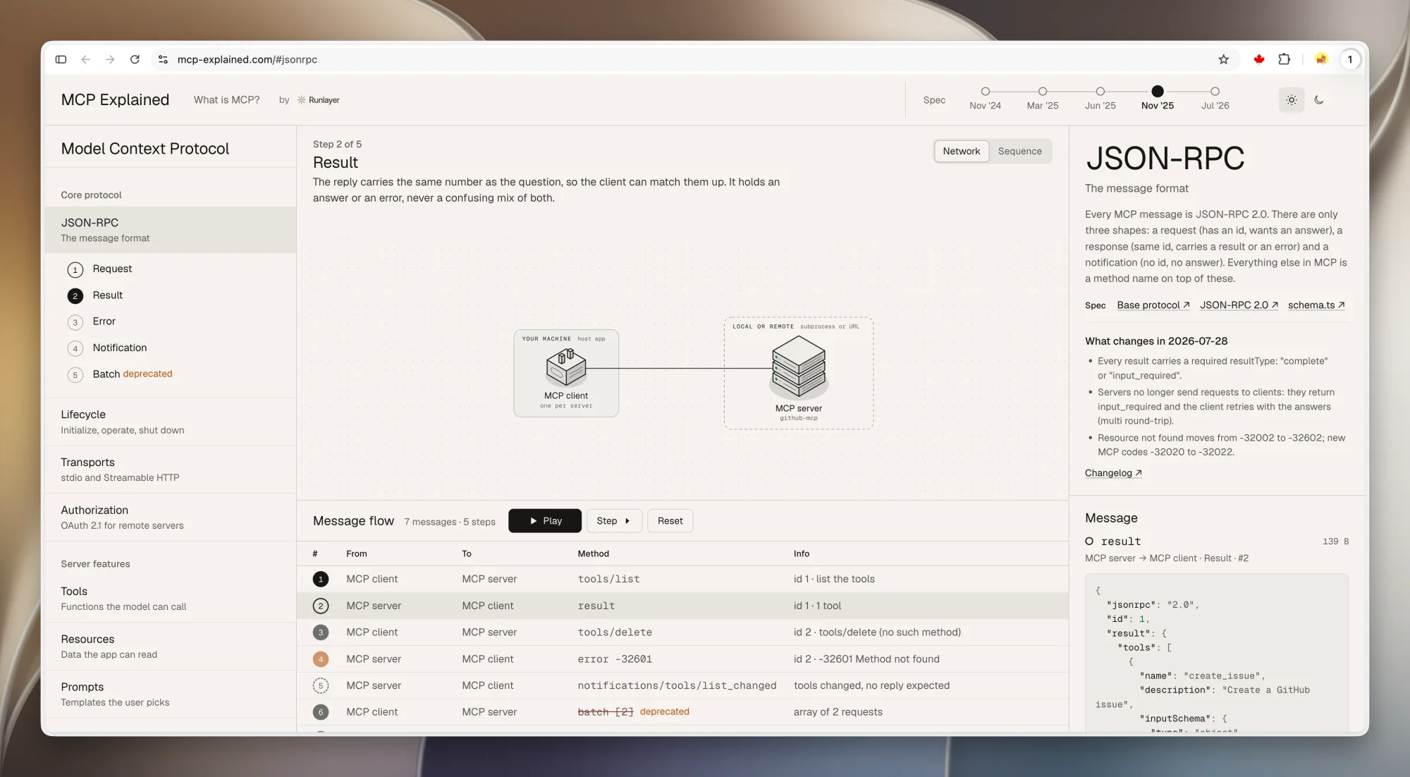
Runlayer’s interactive MCP tutorial looks really good
https://mcp-explained.com/
The idea behind Runlayer’s interactive MCP course is great, so take a look if you want to learn about it. I feel that if I make tutorials in the future, I could just follow this format. It’s pretty nice.
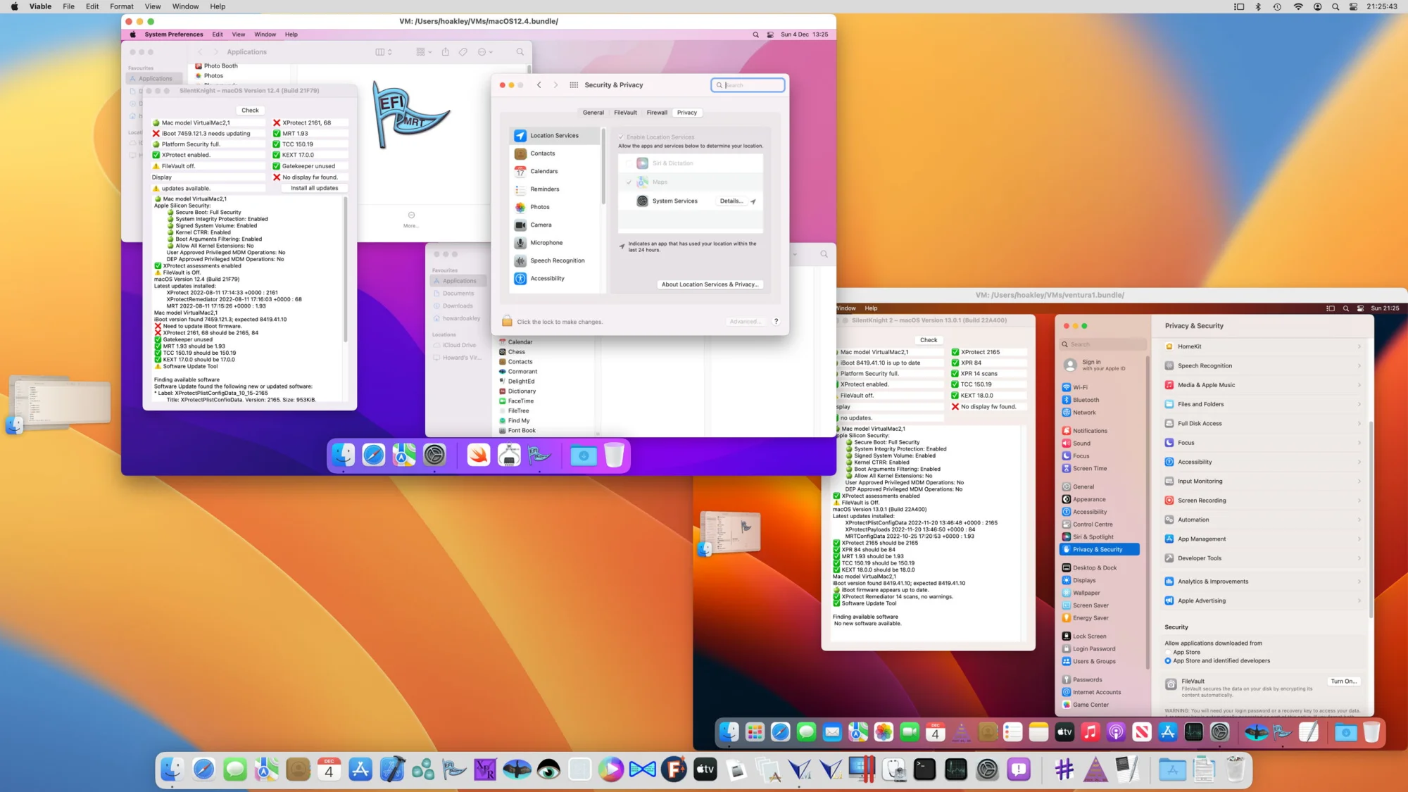
Vimy: a lightweight macOS virtual machine
https://eclecticlight.co/virtualisation-on-apple-silicon/
This looks kind of interesting. It creates a working macOS virtual machine on your Mac and claims to be very lightweight. My current setup is an old M2 Pro that keeps Agents from fighting me for the mouse, and I plan to try this one too and see how it goes.
Kami now has a Xiaohongshu image template
https://kami.tw93.fun/
Kami finally has the social image feature I’ve been using myself for more than half a year. Good content deserves good typesetting. Just tell your Agent to use Kami to turn your content into Xiaohongshu cards and you get this nice-looking result. I even hand-picked 8 different background colors.

Just Looking Around
I can’t recommend this mouthwash enough
I’ve bought nearly 30 bottles over the years. It works really well, it doesn’t burn, and it feels very fresh every time I use it after a meal.

The movie “Happy Birthday” is really good
https://movie.douban.com/subject/37322586
This recently released Egyptian movie, “Happy Birthday”, is really good, and I recommend it if you have the time. Near the end I thought it should run a bit longer, but it didn’t. It doesn’t have the kind of happy ending Chinese movies do, and maybe that’s just how reality is.

These screen cleaning wipes are great
A must for neat freaks! After these Zeiss screen cleaning wipes, a computer screen feels just like when it came out of the box. They’re about 0.5 yuan a sheet and work on camera lenses too. Not especially good value, but the results are great.

|

|
Qingchun Li’s vegetarian food is great in Hangzhou
If you’re in Hangzhou and want to try vegetarian food, you really have to go to Qingchun Li. It’s delicious, especially the black truffle fried rice and the quinoa tofu with Sichuan pepper, and the mushrooms and buns that came after were also very good!

|

|

|

|
Do you still have a habit of writing things by hand?
https://miaoyan.app/
Now that we have AI, probably not many people still write documents by hand. It has a bit of the flavor of that line from the movie “Hidden Man”, “what decent person keeps a diary these days?” I can predict that situations where people truly write articles without AI will become rarer and rarer.
Actually, I started thinking about what a good Markdown note app should be like 7 years ago. First, I think it should follow Markdown syntax completely and also support the community’s extended syntax, but it has to follow the standard, so that your Markdown can be used in any container that renders it, without being tied to any particular piece of software. I think that’s the most fundamental difference between Markdown and Word.
It should also be native, purely local and high-performance, not a wrapped web app, and it should be beautiful too. But it shouldn’t be WYSIWYG, because that very easily breaks the purity of the original Markdown. Back then I’d used Wiz Note, Youdao Note, Quiver, Bear, Obsidian and all sorts of tools, and none of them felt quite right. So, while learning Swift, I wrote this native Swift Markdown note app during a long Spring Festival holiday in early 2020, and somehow I’ve kept iterating on it ever since. Because I use it every day, whenever I thought of something handy I just added it, so the more I use it the better it feels. Later, to keep notes from being broken with no way back, I even wrote a simple git-like feature that records each edit and lets you easily return to an earlier version. It’s also a local feature that uploads nothing to any cloud.
This year I finally had time to add iPhone and iPad versions. Back then, getting the payment for my Apple Developer account to work took writing a letter to Tim Cook in the end, and the first thing I did after getting the certificate was work on this. Because of it, all my open-source Mac software finally stopped showing the dangerous, unverified warning, and it also made the later Mac version of Mole possible.
I’ve always felt that the focus of a mobile Markdown app should be preview. It’s hard for me to write long pieces on mobile, at most I jot down notes, so with the mobile version I mostly focus on rendering and the reading experience, and keep it as light as I can. After using it myself for more than half a year, it has slowly become stable, so it’s ready for you all to play with.
In the AI era, everything I write in MiaoYan is actually written by hand, whatever comes to mind, especially technical articles and my recent long Twitter ramblings. The smoothness of typing matters a lot and no lag is acceptable, the preview needs to be comfortable too, and the typesetting should make things easy to read rather than look flashy.
But more and more people will use AI to write documents in the future, so I added a CLI to MiaoYan. Using miao open, miao new, miao search, miao list and miao cat directly basically covers creating, finding and reading notes, which is enough for now.
Then I got to thinking about what a note app in the AI era should be. I think reading and preview should come first, it should stay light, beautiful and high-performance, it should be AI-friendly, and rolling back versions should be very easy. Ideally it supports git natively, which makes it very convenient for AI to use.
That said, for what AI writes, a Markdown file is really all you need. But in the end it’s for people to read, and what people read should be a finished product, so someone still needs to read and edit it, which brings us back to Markdown editors, only with fewer and fewer people using them. I myself still don’t want to give up the ability to think through and write things on my own. Of course I can get help from AI, but I don’t want to hand my whole brain over to it, or the joy of creating would be gone. If you’re still interested in writing things, come play with MiaoYan.

How do you use AI to make good-looking product design that isn’t so AI Slop?
People often ask me how to use AI to make good-looking product design that isn’t so AI Slop. It’s actually not an easy question to answer, because I’m no professional myself. All I can do is chat with you from a product engineer’s point of view about how to make products that aren’t ugly and are easy to use.
First, there’s a premise to know: very often, good design can’t save a product that doesn’t solve a problem. Design here is only icing on the cake, it doesn’t decide whether a product succeeds or fails. If I had to rank a product’s priorities, it would be solves the problem > easy to use > good-looking, just like first making sure you don’t starve, then having enough to eat, and ideally eating well.
I won’t say much about solving the problem here, since that mostly depends on the product itself. It goes after a specific need, someone needs it, a situation calls for it, and your product happens to offer a solution that lets a person or an Agent reach their goal. It’s just that the problems solved can be big or small.
So how do you make a product that’s easy to use and not ugly? Haha, you can follow along, or you can give the whole section below to your Agent and have it Review your product’s code repository for you.
-
Treat yourself as an ordinary beginner who knows nothing about tech. When they get our product, can they get through the main flow and produce what they need? Where do they get stuck, what isn’t explained clearly, which steps don’t connect smoothly? Fix all of it, so that users can use the product without a manual. If that’s truly impossible, add some hints and explanations where appropriate.
-
All copy has to match the habits of local speakers of that language. Weigh the wording carefully and don’t do dry translation. You can look to Apple, Windows and well-known websites for the best translations and explanations of similar terms, and make the copy feel as simple, easy to understand and clear to locals as possible.
-
Where the product itself can make something clear, don’t add explanatory copy, and don’t explain things long-windedly. Think carefully about whether each piece of explanatory copy gets its meaning across without rambling. Where interaction and visuals can say it clearly, don’t say it again in copy.
-
When presenting numbers, make users understand what the data refers to, and consider how easy it is to read given what it means. Money, metrics, distance and all kinds of units each have their own best practices to consider. Data accuracy is very important, so don’t skip validating data out of laziness.
-
Don’t keep asking users to confirm operations they’ve already decided on. Only ask for a second confirmation when something would have an irreversible effect, so the screen doesn’t fill up with confirmation dialogs. Don’t use large areas of red for dangerous operations. Consider how pleasant the product is to operate. Users aren’t fools, so don’t worry too much about them making mistakes.
-
Visually, keep only one accent color on a page. Try not to use orange, terracotta or the old-enterprise bright blue common in admin dashboards. Make all greys warm, and don’t use cold blue-greys. If you can’t find a suitable color, go look in the traditional Chinese colors.
-
Keep the number of type sizes as small as possible, at most 4 different sizes on a page. Consider the overall reading rhythm of the page, its clarity and the contrast of the text, and make sure it meets accessibility standards. Line spacing, letter spacing and paragraph spacing all need repeated adjusting, while the overall system stays consistent.
-
Use italics, monospace fonts and all caps sparingly, and any use has to come with a detailed reason. Don’t use italics for explanatory copy, use monospace only for code, paths and metrics, don’t capitalize the words in buttons and labels, and rarely use the middle dot · to connect content. Use only one verb for the same action across the whole product. Also, try to pick verbs that don’t rush users into acting, for example go easy on marketing words like “buy now”.
-
Keep design rules like the page’s buttons, spacing, corner radii, dividers, dialogs, animations and shadows consistent, and stay restrained so they don’t disturb users. Nested corners should be concentric, and it looks better when the inner radius equals the outer radius minus the gap. Pages are flat by default: no stacked shadows, no glow, no frosted glass. Shadows are only for dialogs that truly float, and don’t put cards inside cards.
-
In a multi-language setting, plan the layout around the longest copy first, and put getting the meaning across ahead of changing the original meaning for looks. You can change the copy, but don’t change the type size or truncate it. Pay special attention to whether it displays well at different sizes, think about the devices users commonly use, test them all, and fix everything that isn’t good.
-
For a design that keeps failing to come right, or that still doesn’t look good after many rounds, have your Agent come up with the 3 options it thinks are best for you to choose from. Then pick the better one and tell it to refine that until you’re happy. I like having AI put before and after comparison images into one PDF, which gives me a much better reading and comparing experience.
That’s roughly it. But there’s one more very important thing, which is your own patience and repeated adjusting. I’m a bit obsessive, and often discuss a single line of copy, a color or a design with AI for a dozen or more rounds, until I’m happy with it. AI is very smart, but very often you need to ask more of it, and you need to put in more time and patience to get a result you’re satisfied with. Or to put it another way, if you spend more time and look at more good design, you can actually make products that are easy to use and not ugly.