 282. Night Fog Shanghai 中
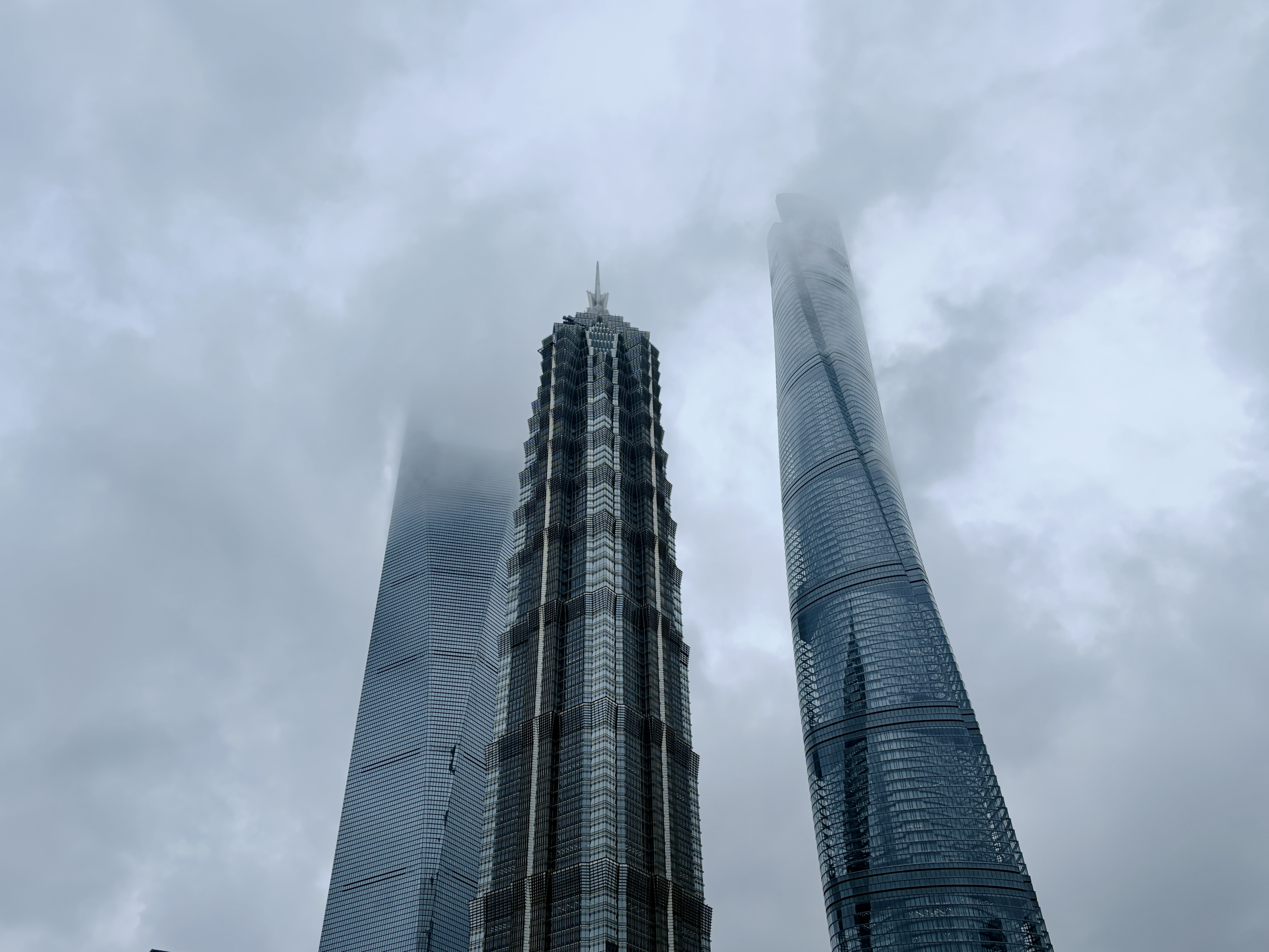
The cover was taken a few weeks ago in Shanghai, on a foggy evening just before dark. It has a real feel to it. The title should probably have been Fog Shanghai, that would have even more of that feel.
Recording down-to-earth trending tech I see every week, filtered and published here. Follow this weekly newsletter to get update notifications
Trending Tools
Mac Duo: bring the iPhone Duo closing animation to the MacBook
https://github.com/sumimakito/Mac-Duo
Haha, not really useful, but kind of fun. When you close the lid the screen tilts, blurs, and fades out. You can adjust the viewing angle from the menu bar. Needs a model with a lid-angle sensor.
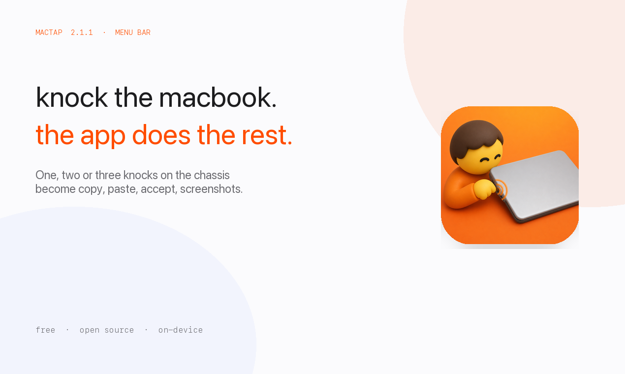
MacTap: tap the chassis or the desk to trigger shortcuts
https://github.com/jaskirat1616/mactap-app
This one is pretty fun too. Tap the chassis or the desk to trigger shortcuts. One tap, two taps, three taps can all be mapped. Pretty much M2 and later machines support this. Good for home use.
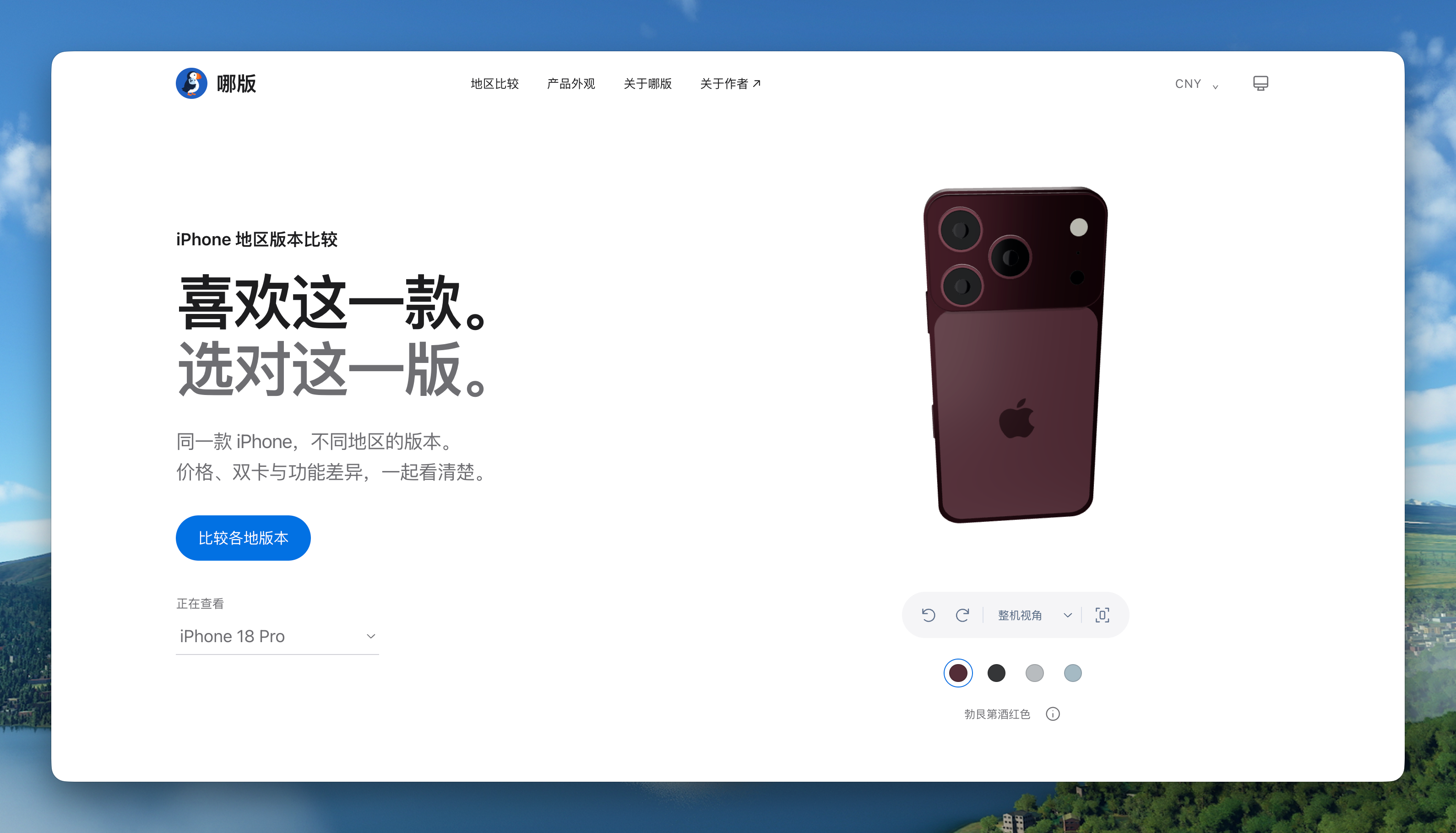
NaBan: a table comparing iPhone SIM, Apple Intelligence, and warranty differences by sales region
https://naban.barrybarrywu.com/
A table comparing iPhone SIM, Apple Intelligence, and warranty differences across sales regions. If you are torn between the mainland, Hong Kong, and US versions, take a look. I am probably not buying one this year. The Air still makes me pretty happy.
Saw this Xiaohongshu video by Mac Zhang introducing Mole
Saw this Xiaohongshu video by Mac Zhang introducing Mole. He put a lot of care into it. Showing a product in video is way clearer than the text version, and product people could learn a lot from it. Thanks for the intro. If you have not used Mole yet, I really recommend watching this. He covers almost every feature clearly, better than the official site. When I have time I should learn to make videos too.
Just Looking Around
We Must Pace the Frontier
https://darioamodei.com/post/we-must-pace-the-frontier
A big piece of weekend news in the AI circle. Dario publicly called for slowing down capability iteration, and Musk bought in too. Worth a read.
Come listen to Dou Wei’s Higher Animals~
Dug up an old CD of the 1994 Chinese Rock Power concert. Come listen to Dou Wei’s Higher Animals~
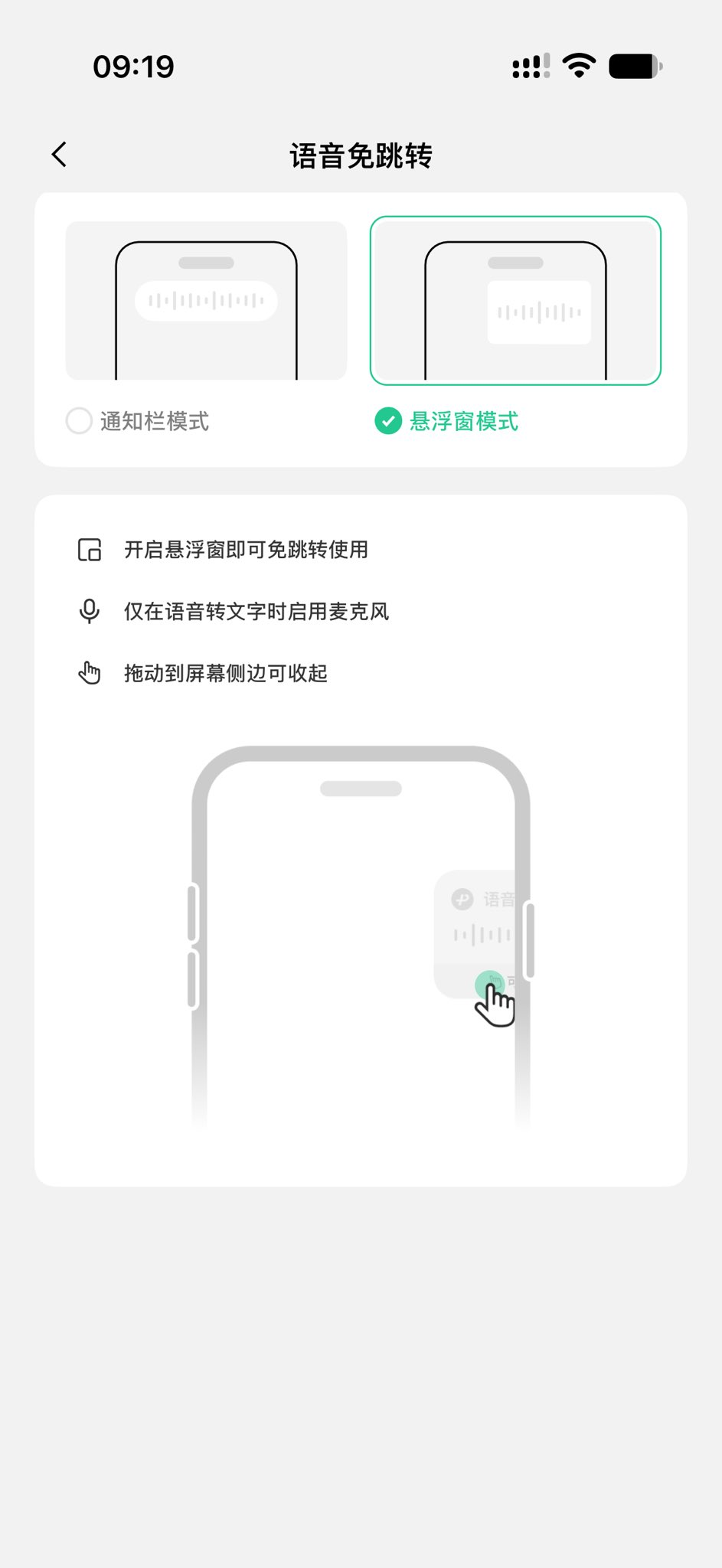
iOS third-party keyboards got a new feature, no more jumping out for voice
iOS third-party keyboards got a new feature. Finally, finally, using voice no longer jumps you over to the app for a flash. Usually you just turn on floating window mode in the keyboard settings. This is the WeChat Keyboard setting. If you use it, give it a try, so much more convenient.
Just writing: suddenly felt like chatting with you all about how I think about document layout
Suddenly felt like chatting with you all about how I think about document layout.
Kami, a content layout engine that feels good to use in the AI era, has been iterating the whole time. Recently I changed a lot of details and also cut a fair amount of extra stuff. The process of cutting things gave me quite a bit of thought about simple, easy-to-use product design.
First, the job of content layout is to help people read better and understand more clearly, not to show off, not to look pretty while losing the content itself, and not that heavy, intimidating, big-company PPT look. Content first, then layout. Do not crop interesting content just to fit some template, or pad in a few extra sentences. That is how you lose the more honest flavor you originally had.
While keeping font choice, letter spacing, line height, font size, module spacing, corner radius and so on looking consistent, comfortable, and rhythmic, what we actually need to think more about is who this document is for, what you need to say first, what the main content is, and what you hope the other person walks away understanding. Then you turn that into a clear layout, so your reader knows where to start, what matters, and what is extra.
Charts and images are the same. A chart where you can see the pattern, an image that actually explains the thing, often works much better than text alone, which is why people sometimes say a picture is worth a thousand words. But do not drop in an unrelated image just because adding pictures looks nicer. The reader still does not know what it is trying to say, and that is a minus.
The way I understand “do not multiply entities without necessity” is, when I add something I usually stop and think, this line, this box, this background, after I add it, what exactly is it helping the reader understand, buddy? If font size, spacing, and alignment already make the relationships clear, there is no need to stack another layer of decoration. If something genuinely helps reading, you also do not have to delete it just to chase minimalism. You can keep it, like bolding or a color change.
The last few Kami versions have been doing exactly this. I killed those useless decorative short lines next to titles, removed the blue vertical bar on callout blocks and the extra shadows, made table lines thinner and lighter, and opened up the spacing a bit so it is easier to read. I also turned the requirements and suggestions above into test-script checks, so if AI generates something by accident we catch it before it slips through.
I hope Kami can help more people handle these layout details, and then you just spend more time on what you actually want to say. That is what Kami has always been after: good content deserves a good layout.